The largest

The largest

The largest

buying & selling used cars

buying & selling used cars

buying & selling
used cars

web-portal in Turkey

web-portal in Turkey

web-portal in Turkey

UK based startup

The client works in the used car sales industry, providing B2C and C2B services for buying and selling used vehicles.

They approached with a need to modernize their online presence and improve the user experience for their customers.

570
570

k

k

+

+

Monthly visits

570

k

+

Monthly visits

1
1

+

+

Locations

1

+

Locations

670
670

M

M

+

+

Annual revenue

670

M

+

Annual revenue

Solutions that increased

conversion in sales.

Redesigned features:

Buy a car

/

Checkout

Sell a car

/

Car valuation

Trade-in

/

Buy&Sell

Results

Here’s the impact
of the design changes

Here’s the impact
of the design changes

Here’s the impact
of the design changes

+0
+0

%

%

Purchase
Conversion Rate

Purchase
Conversion Rate

Purchase
Conversion Rate

+0
+0

%

%

Website
Loading Speed

Website
Loading Speed

Website
Loading Speed

What made it work:

The user-friendly and intuitive design increased customer satisfaction and ease of purchasing used vehicles online. Simplified the buy/sell process for high-cost items, ensured a secure transaction flow, and proved efficiency by conversion metrics.

APPROACH

Design process

Design process

Design process

A design process follows a design thinking approach, where I first identify and understand the problems and needs of users and stakeholders before diving into the design phase. Once the design is ready, I conduct thorough testing to ensure its effectiveness and gather valuable feedback for further improvements.

People in the office

BUY A CAR

Catalog

Catalog

Catalog

Discovery

UX process

UX process

Began by conducting extensive research into the client's business needs and user personas. This informed the redesign of their website, which was tailored to meet the specific needs of their target audience. Also conducted qualitative user interviews to gain further insights into their customers' needs and preferences, which informed the improvement of the website's interface.

People in the office

USER-FRIENDLY

Mobile-first designs

Mobile-first designs

Mobile-first designs

Trade-in

/

Catalog

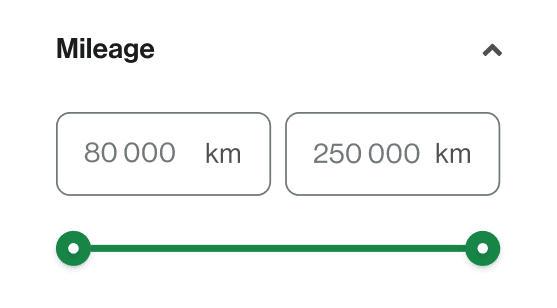
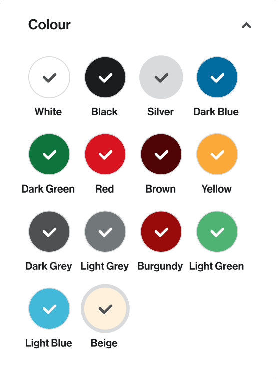
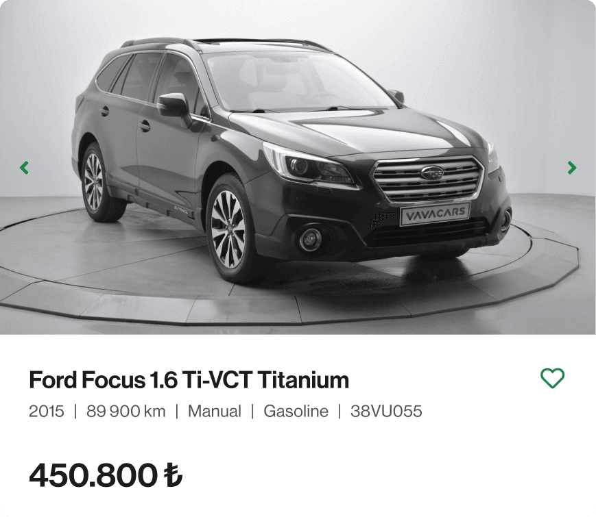
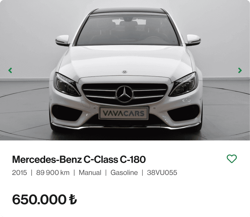
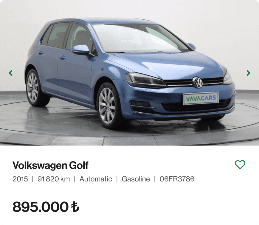
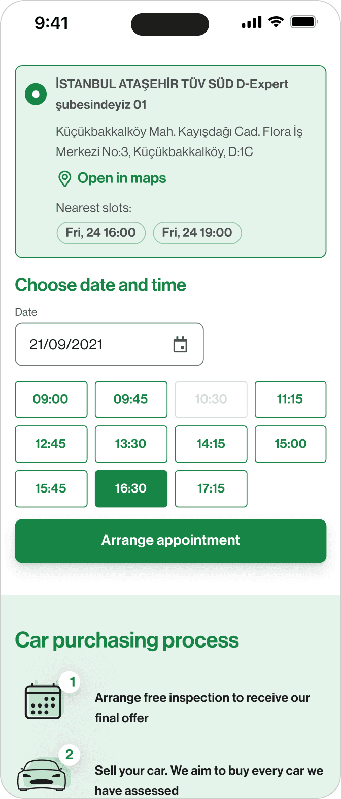
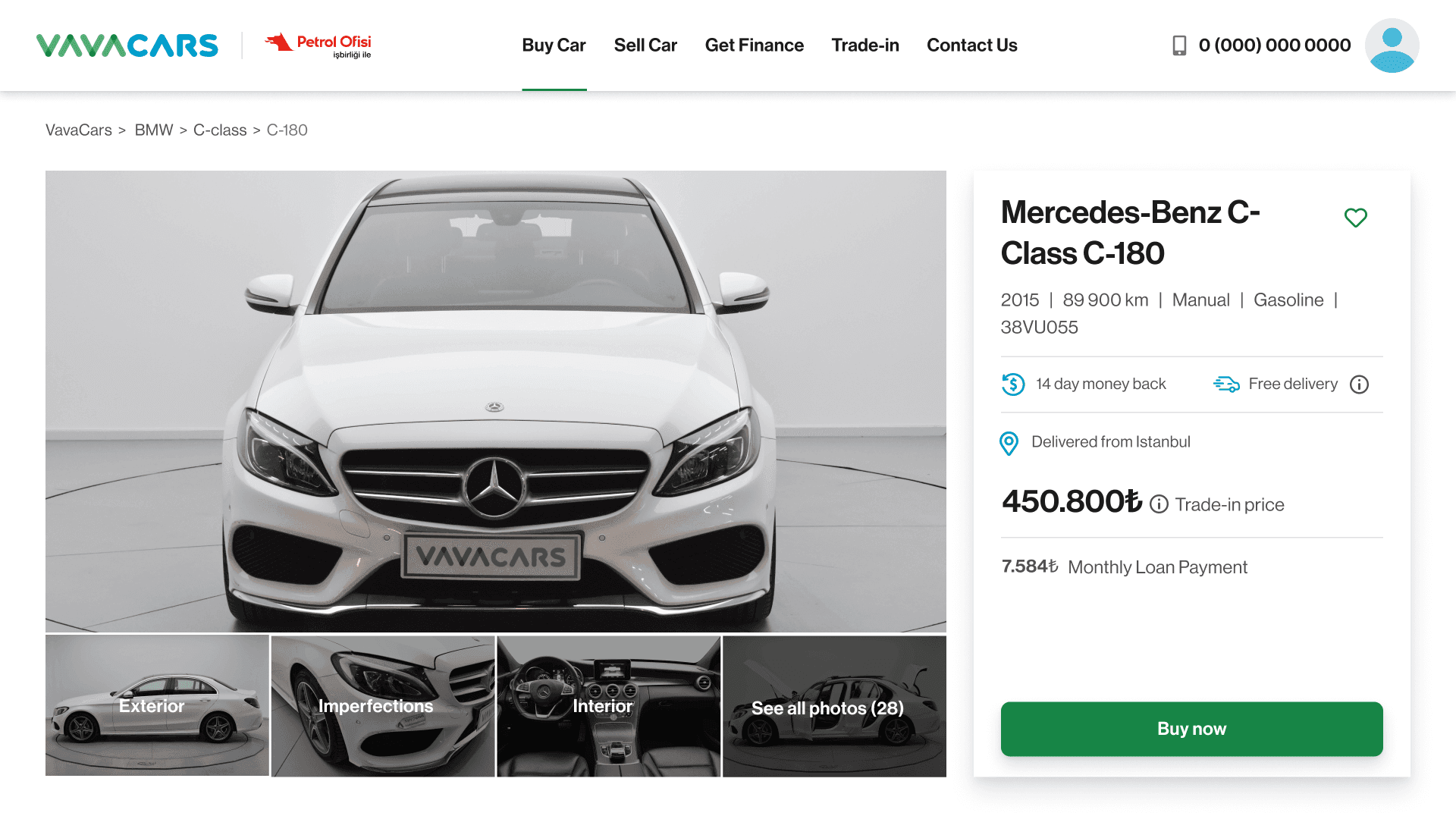
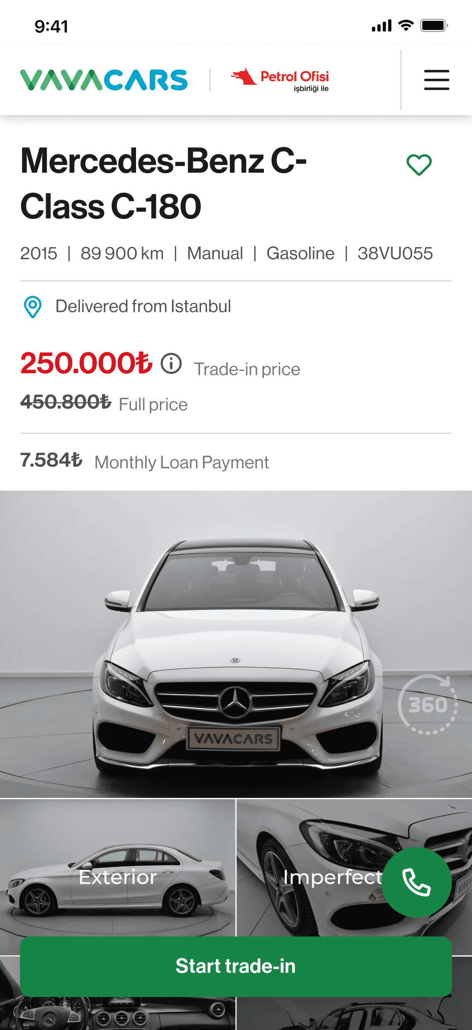
Created and tested the buy car flow that showed high efficiency in conversions

Created and tested the buy car flow that showed high efficiency in conversions

Sell a car

/

Wizard

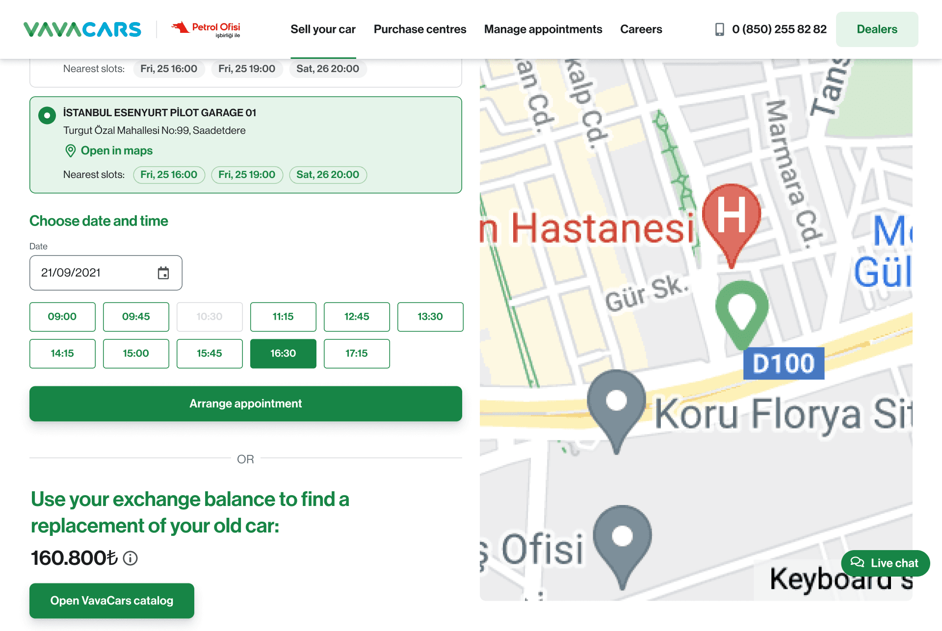
Updates in the sell car flow improved customer satisfaction and reduced churn rate

Updates in the sell car flow improved customer satisfaction and reduced churn rate

Buy car

/

Order page

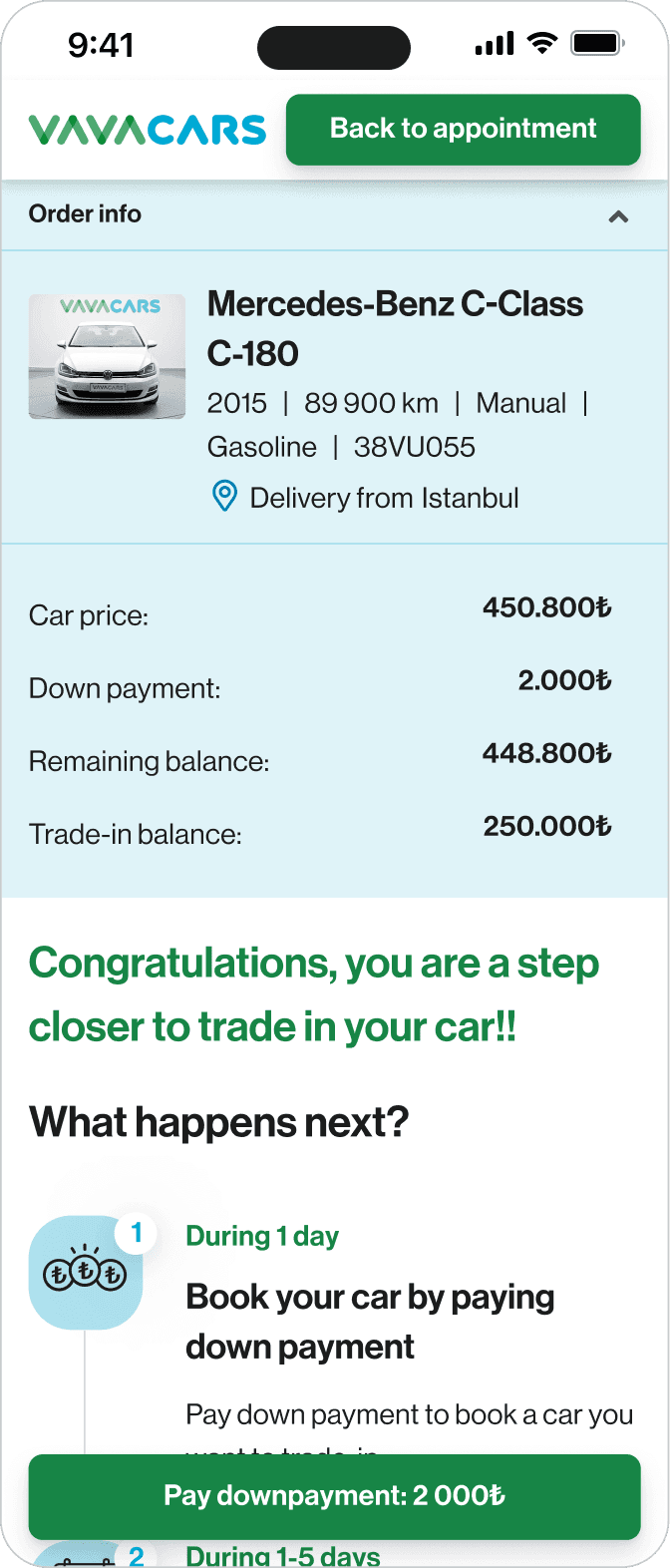
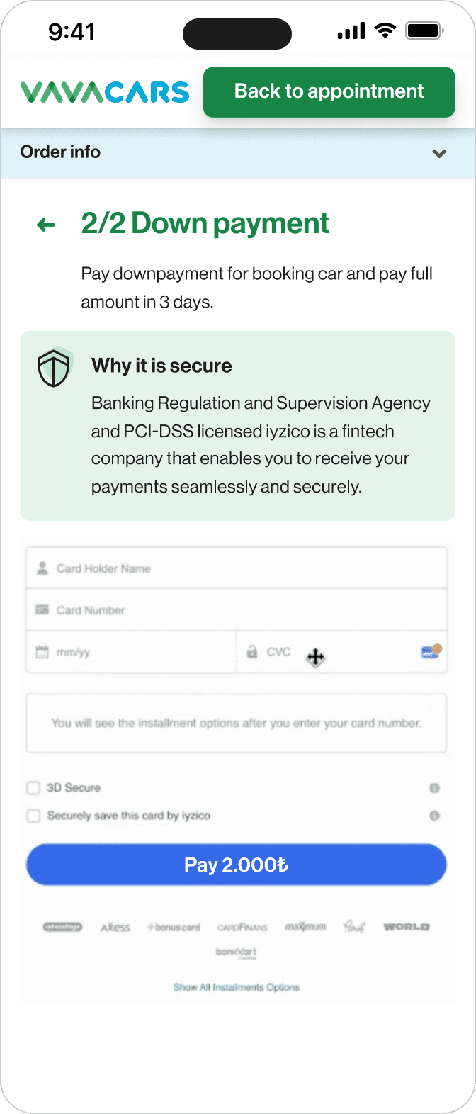
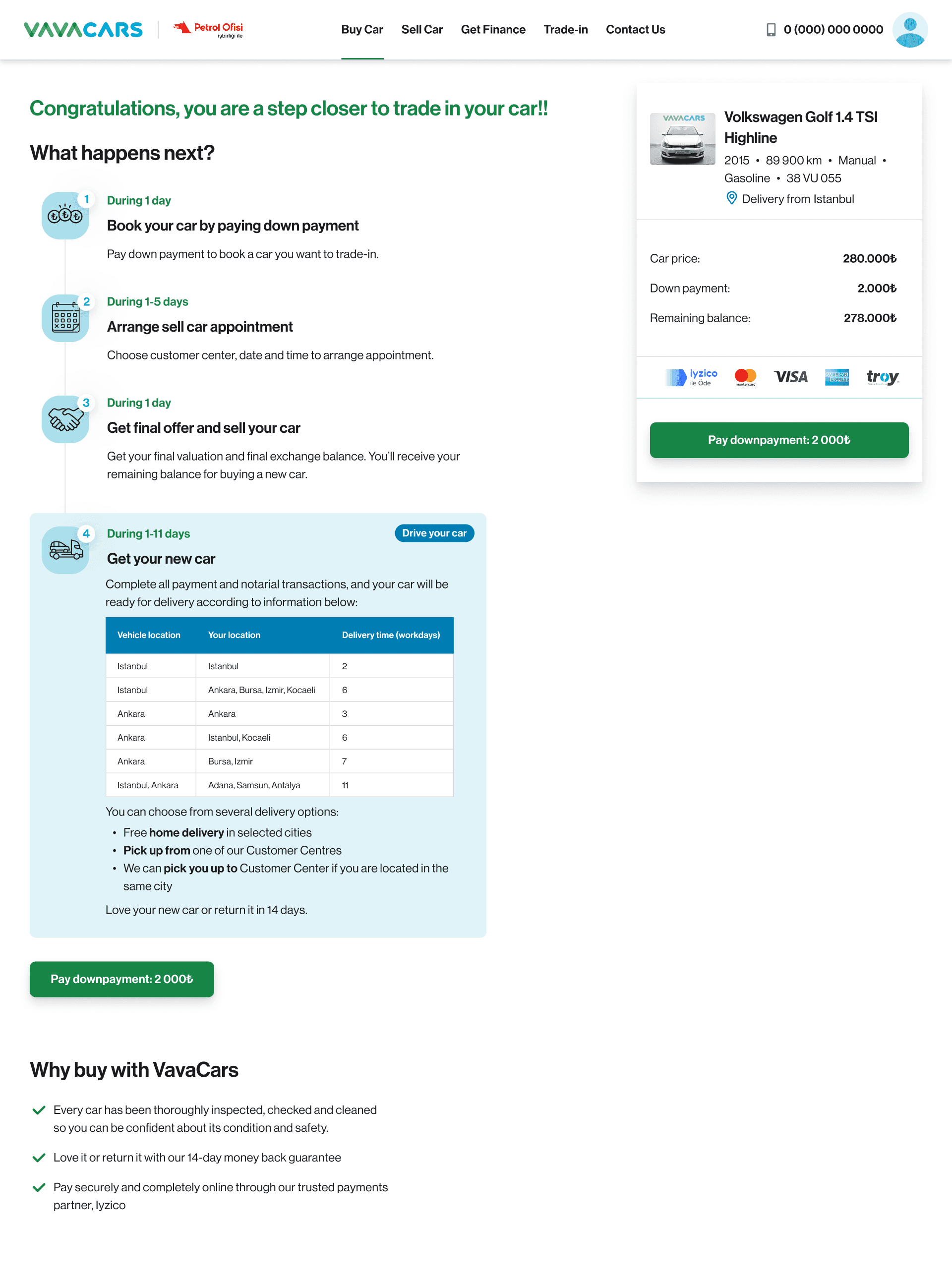
The interactive check order status page showed significant usability improvements in user interviews

The interactive check order status page showed significant usability improvements in user interviews

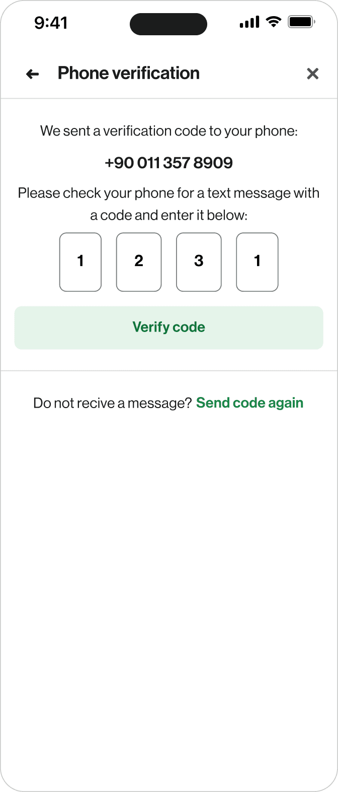
Trade-in flow

One of the key objectives of the project was to integrate all of the client's B2C and C2B products into one central system.

One of the key objectives of the project was to integrate all of the client's B2C and C2B products into one central system.

UX/UI design

Designs

Designs

INTEGRATION

75+ car brands are presented on the platform

75+ car brands are presented on the platform

75+ car brands are presented on the platform

UI design

Design system

Design system

The design system was built in Figma and implemented on Angular in order to keep consistency throughout the platform. The use of this design system enhances the overall user experience, providing a seamless and cohesive interface for visitors to navigate and engage with.

The design system was built in Figma and implemented on Angular in order to keep consistency throughout the platform. The use of this design system enhances the overall user experience, providing a seamless and cohesive interface for visitors to navigate and engage with.

Styles and elements:

Styles and elements:

3000+ Figma component variants

3000+ Figma component variants

3000+ Figma component variants

People in the office

Grid system:

People in the office

Impact

Testing

Testing

Testing

The redesigned website received positive customer feedback, and the client saw improvements in key business metrics, such as conversion rate and customer satisfaction. At the same time, constant testing helped to find imperfections before development implementation and avoid drop-offs.

Analytics:

To measure product success, we've built funnels and measured the conversion rate, which is within the golden benchmark standards for this industry.

People in the office

Let's talk about your project:

Let's talk about your project:

Let's talk about your project: