
Trading fintech project
Created 15+ convertable new brands that included designing for each: landing pages, corporative website, registration process, and branded trading tool.
Increased optimization speed for new brands by 73% with Figma libraries/components/design systems that allow adapting pages faster.
Increased registration conversion rate by 28% and reduced registration speed by 50% with redesign and user flow optimizations.
Launched a mobile app. Created and tested UX prototypes before the launch to avoid potential problems.
Design team productivity with design materials optimization according to the company reports.
The conversion rate of the registration process with onboarding improvements.
Increased the retention rate with the trading platform improvements.
Increased the registration speed with questionnaire and verification improvements.
What the client expected
Creating unique concepts for corporative websites, as the project is supposed to be a diversification business model with unique brands for different markets.
Improving an existing trading web-app that was created as an MVP solution.
Designing and developing a mobile application from scratch.
Analyze and improve user flows and funnels within all company's products.
Design scope:
The strategy has been created based on a design thinking approach where we are paying attention to the introduction phase before starting our work to collect all the problems stakeholders see and users face. After designing another tasting phase was initiated to see if problems were solved effectively.
It is a circle of testing and solutions in order to define what design solutions work the best for the project and its audience.
UX research
Competitor analysis: Helps to define strong and weak points, find opportunities.
User persona: Helps to identify users' motivation and build user flows effectively.
User interviews: Identify user problems with qualitative data.
Product metrics analytics: Identify problems with quantitative data and compare them with new updates.
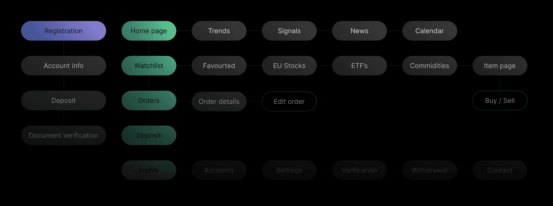
Product architecture: Helps to build the flow and prepare the structure for development.

Websites & Landing pages
For the first touchpoint of the user journey, the focus is on developing captivating landing pages for various trading assets within the ecosystem. Each landing page represents a specific topic and utilizes visually appealing effects to increase conversions. The primary objective is to engage users and drive them to take action during their journey.
Furthermore, websites were developed for each brand, showcasing platform advantages and enhancing user trust, which is important in this industry as it operates with cashflows.
The research stage helped to define the main problems and build websites and landing pages that address users' pain points, goals, and needs.

Onboarding & Registration
Once users click on the landing page CTA, they initiate the registration process, which presented a challenge in ensuring its simplicity and intuitiveness.
Despite the trading regulation restrictions, which resulted in a 5-step registration process with additional steps within each, we successfully improved the conversion rate by 28% and reduced the registration time by 50% through effective UX practices.
Trading platform
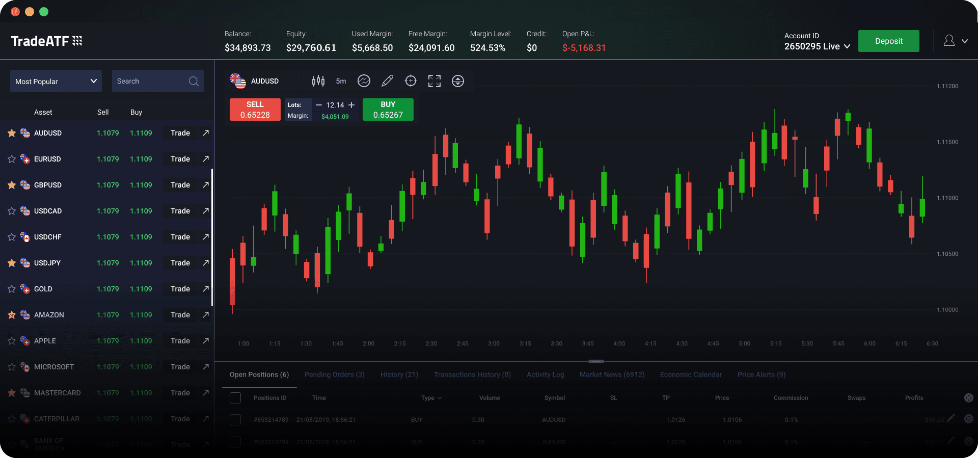
After completing the registration process, users gain access to the online web platform for trading. Design-wise, it is crucial to prioritize user-friendliness by ensuring intuitive and accessible primary actions.
Mobile app
Moreover, a mobile app was created from scratch, complementing the web-trading platform and providing users with quick access to trading functions and real-time market updates. In the design process, we began with a prototype that underwent user testing before finalizing the user interface (UI) design.


